


UI design trends: what will 2023 bring?
UI (User Interface) is what distinguishes some websites and applications from others. Appropriate fonts, colours, arrangement of texts, graphics, and buttons – all this affects the comfort of using the platform and the general emotions accompanying interaction with it.
Although users and their tastes are different, the visual arrangement of elements on the page or in the app must be intuitive and simple for each of them. UI design focuses on this practical aspect of design process. A situation in which the user cannot find some elements or tab he is interested in, or when the interface is unreadable for him, will cause him dissatisfaction. What happens next? The user leaves our site, discouraged by a negative experience with it.
We mentioned individual tastes when it comes to the visual layer of websites and applications, but it is worth mention, that there are certain trends in interface design that influence the success and popularity of the tool. What does it look like in 2023?
UI Trends 2023
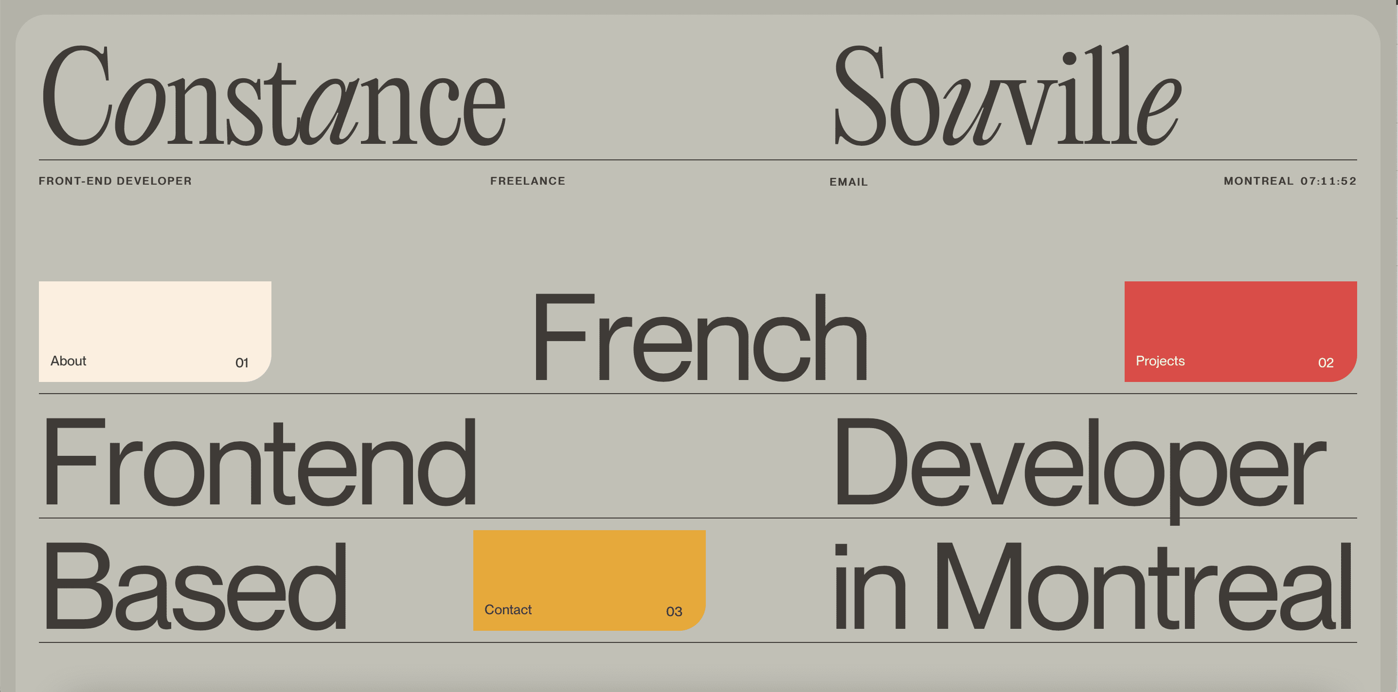
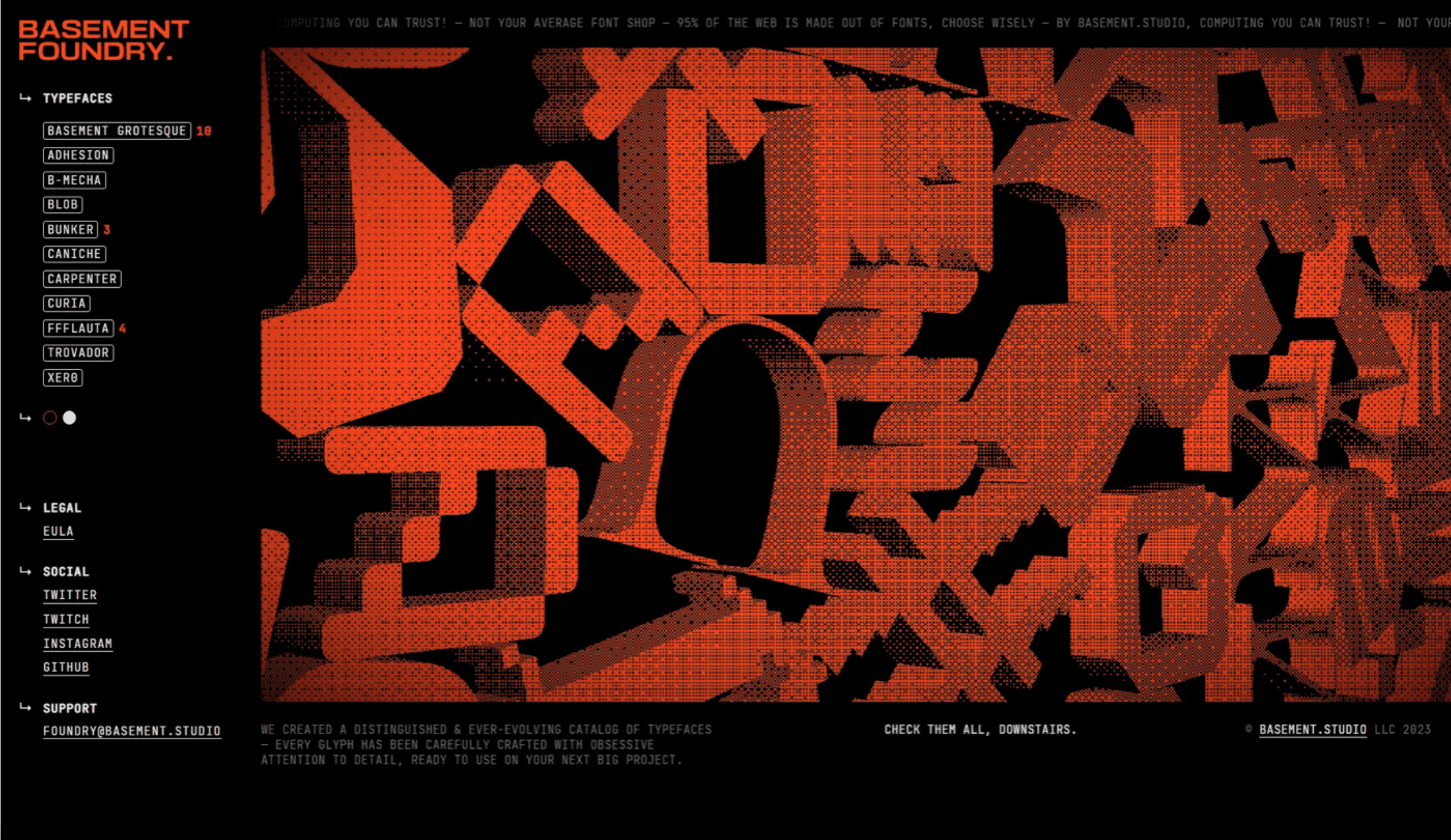
- Varied typography
The visual aspect of fonts in a project, is one of the most important aspects of website design. Not only the text on the page is influential, but also the form in which you present it. Fonts are selected in such a way that they harmonize with the image and message of the company, while attracting the attention of the web/app user. What we see more and more often, is the bold combination of different fonts in one word or sentence. Creativity and character displace stability and uniformity of texts.
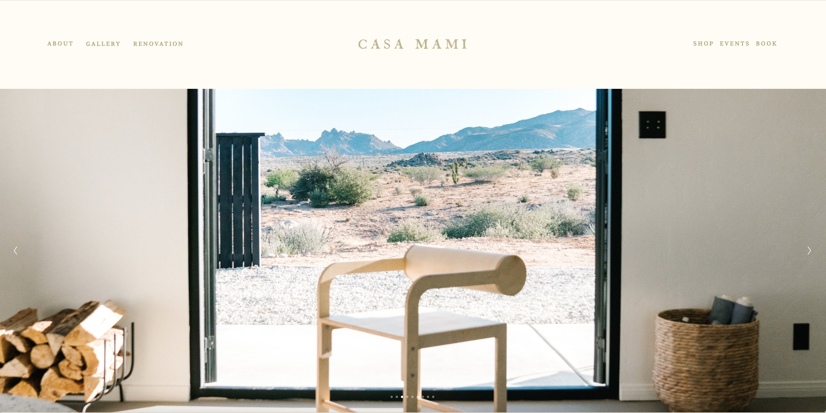
- Minimalism
Minimalism has always carried a sense of elegance and careful planning of space. This year shows us, that the first screen, which appears after the user enters the website, can contain simple, minimalist graphics and a piece of text, instead of CTA buttons with redirects to other subpages. The minimalist design will remain fashionable for many years, ensuring fast page loading and a pleasure of use.
- Custom text layout
Today, crooked inscriptions, obliques, deviations or combining horizontal and vertical texts, do not surprise anyone. What’s more, they almost always attract the attention of users, giving the feeling that something is happening on the site, and this “something” is absolutely not boring.
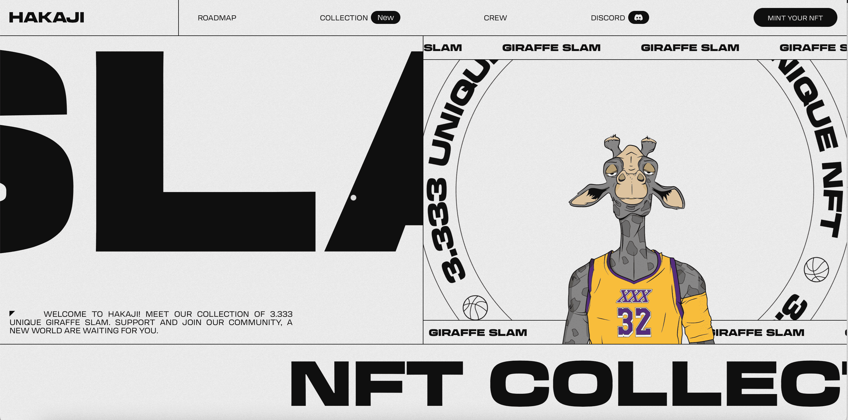
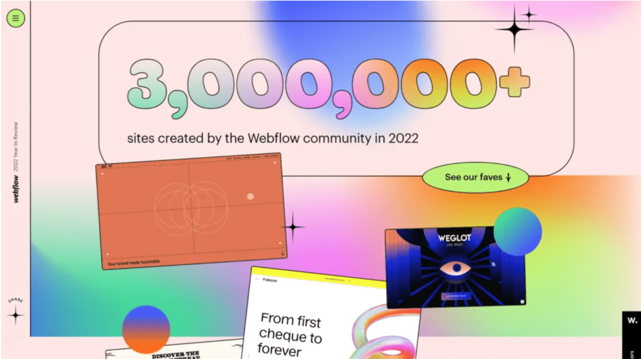
- Futurism
Virtual reality is growing in popularity, and references to it can be found in every corner. Futuristic elements, shapes, and bold colours on websites are a carrier of modernity and development. Bold gradients and drawings, that are giving the impression of being in motion, are a window into modernity, and the attractive presentation of data and elements on the website, is the quintessence of futurism in design.
- Neobrutalism
Will you like this trend or not because of its… rawness? It is an interesting alternative in website design. Neobrutalism offers us strong contrasts in colours, sharp edges, rawness of the message, or figures without shaded colours. Elements and a combination of colours, that we could even consider incompatible, rough in perception.
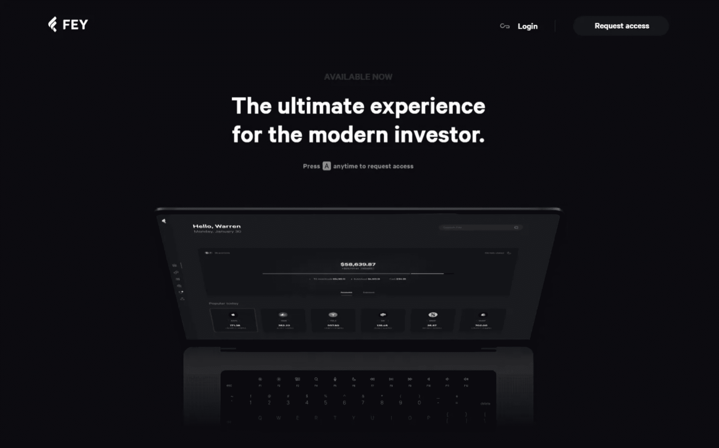
- Dark mode
Websites and apps are increasingly switching to dark mode. Some apps let users choose which modes they want to use. Judging by the data available to us, dark mode favours users on several levels:
- Dark mode reduces the amount of bright light that reaches our eyes and tires them (for photosensitive people. it is a great convenience);
- If your device has an AMOLED or OLED screen, know that dark mode saves battery;
- Visual issue: colour merging looks different in light mode and different in dark mode. Designers match a specific mode to the message and aesthetics of the brand, appropriately choosing the colour of the fonts, colours, and gradients that scroll through the page. Dark mode, which encourages some, overwhelms others – but it cannot be denied that it is becoming more and more popular.
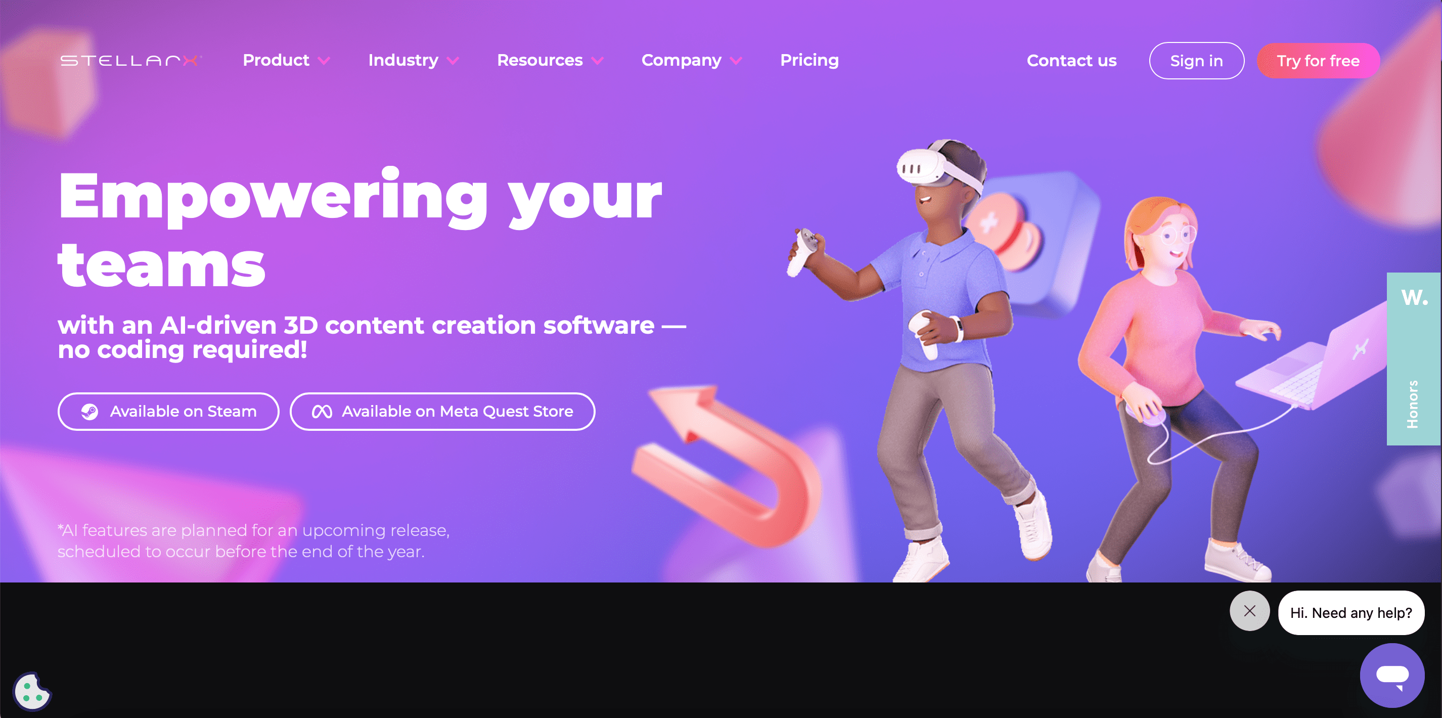
- 3D elements
3D elements are memorable and our times clearly show it. If this is the right direction for your brand identity, don’t hesitate. The modernity and depth of non-standard 3D elements are gaining a wide range of supporters. Just do not exaggerate with their number on the page, so as not to harm its readability and clarity. For example, when deciding on 3D, which is not static graphics, take into account that the use of moving elements affects the performance of pages on various devices, especially those that are older or do not have the latest updates.
- Micro-interactions
In addition to the obvious attraction of the user’s attention, micro-interactions have the function of activating users. Thanks to moving elements on the page, pop-up windows or moving text, the attention of the recipients is constantly drawn to various points on the site, which encourages further exploration and clicking. As in the case of moving 3D elements – micro-interactions and all animations affect page loading speed.
These are just some of the trends that may grow in popularity in web and app design in the near future. UI design continues to evolve and change, surprising us with better and better user experiences.


