


Top 5 principles of typography for good UI design | Principles of typography
Principles of typography
These days typography plays a significant role in making a user interface both clearly understandable and intuitive, as well as beautiful. Remember that good typography is often your key to success. If something is nice and legible, it will be better understood and will attract more audiences. Some creators often leave typography at the end, treating it as something less important, when in fact this is the core of the design. Even though it might seem to be a very different thing to design a mobile application, website or a printed magazine, some principles of type-centric design apply for all of these and more.
If you think you know this topic perfectly, it is always worth verifying your knowledge. Learn all the principles of typography in UI design.
What is typography in UI?
Typography in UI design really matters to the recipient. You come to a website and find out that something is illegible, unsightly or just plain ugly. What do you do? You don’t like what you see – you leave. This way you can realize that principles of typography are one of the most important things when it comes to design.
Choosing the right hierarchy and sizing, fonts, text alignment, spacing and colour all play a role in the success or failure of your project. It is crucial that you understand how essential the principles of UI design typography are, do not diminish their importance and learn to choose the right parameters for your projects. In this article, you will find five rules that you must always consider when working with text.
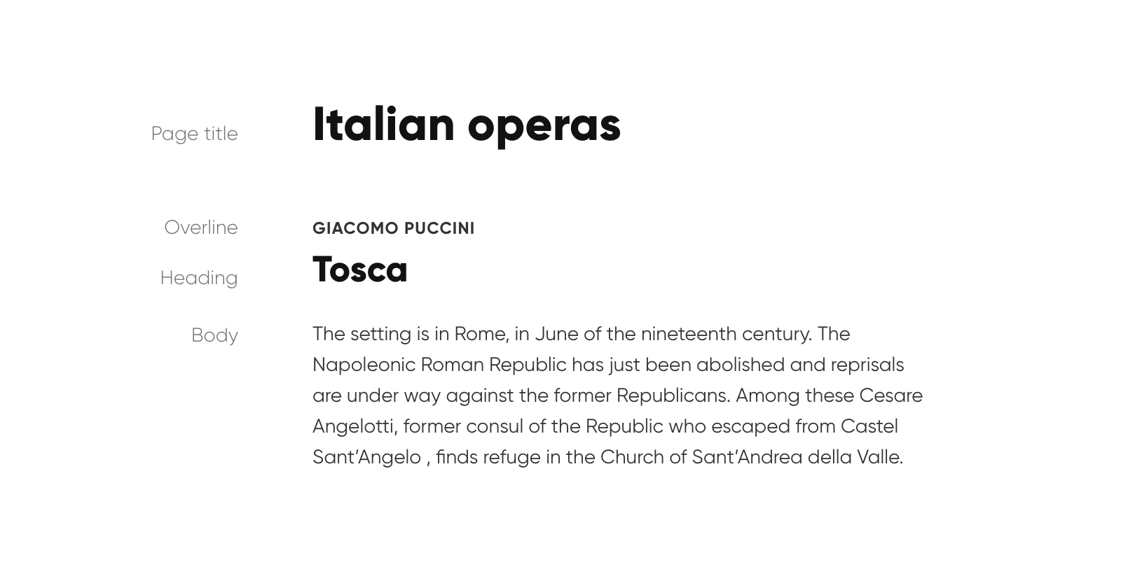
Hierarchy and sizing
First of the principles of typography are hierarchy and sizing. To provide some basic structure to the design elements it’s crucial to put text in order. And when there is a hierarchy in your project there are text elements in different sizes. Would you make page headline larger than body copy? I hope not. Below you can find a cheat sheet presenting most common proportions for standard displays to make your design go smoothly.
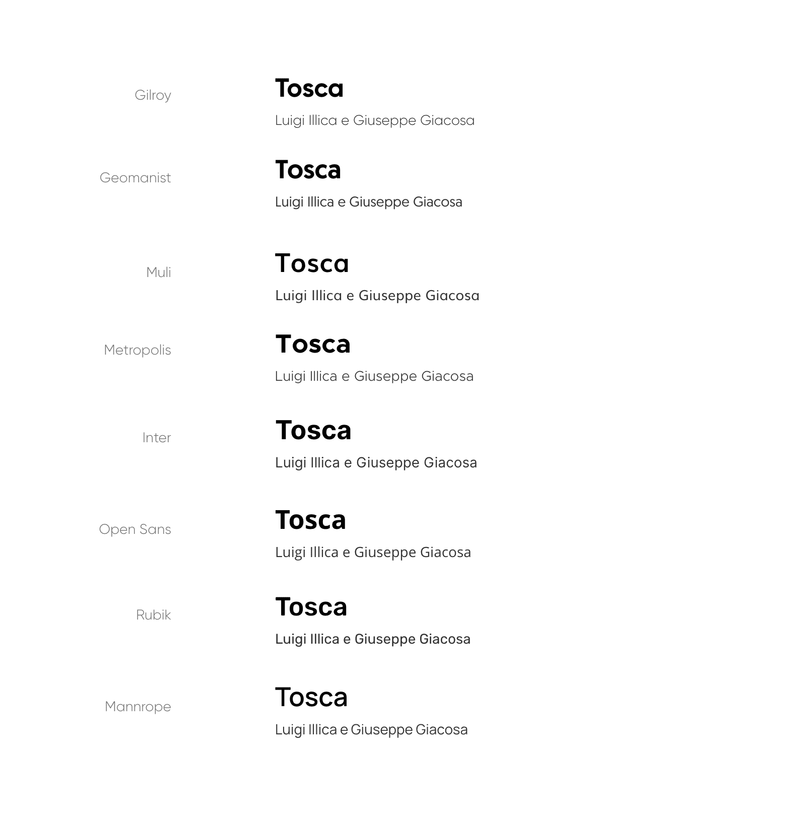
Fonts
There are plenty of font foundries and their vast offer to choose from. But when it comes to interface design less is more. No matter if you are going to purchase a professional font family or use some of freely available fonts simplest options are the best. In most cases simple means Sans-Serif because it is easy to read on digital displays but always keep in mind your project’s main purpose, its desired look and feel. Although I encourage you to find a perfect match it’s more than O.K. to stick with just a few free fonts for most of your UI projects. Here are some examples.
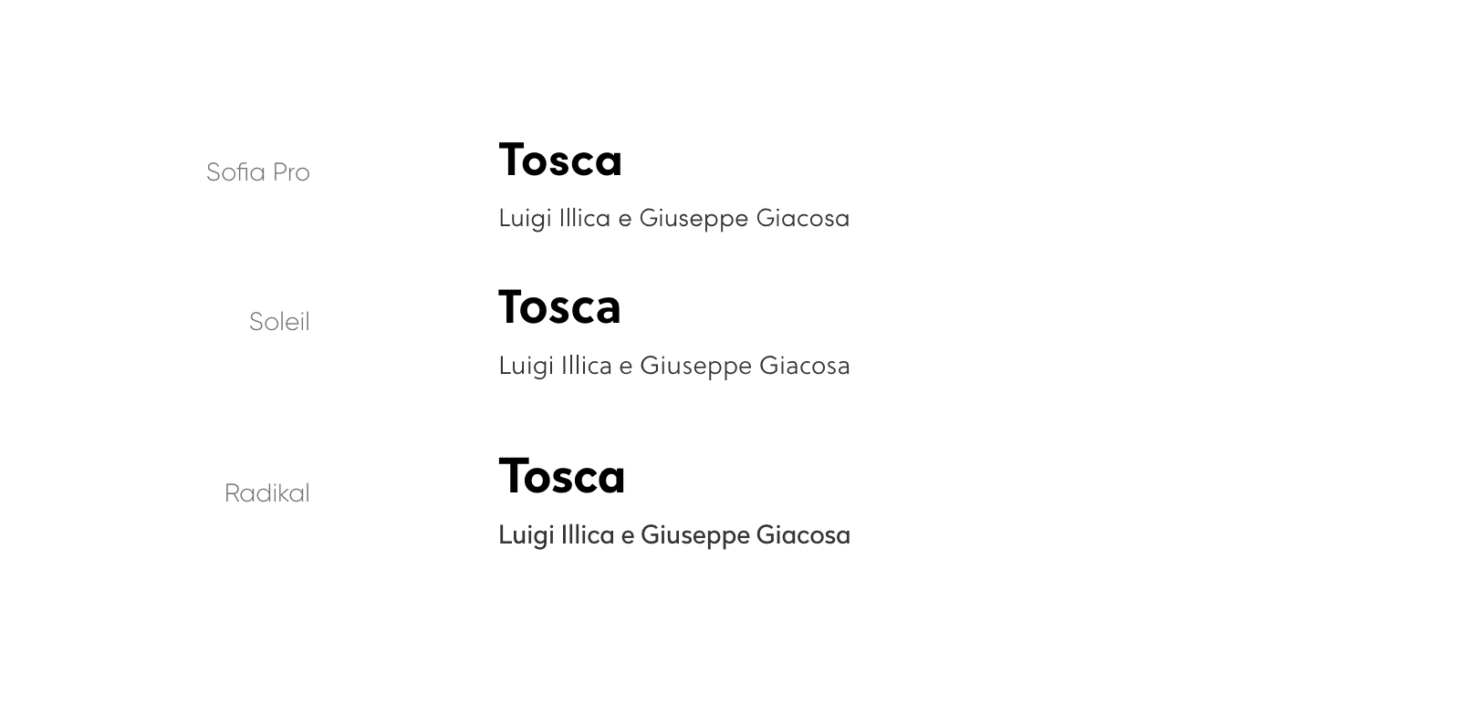
If you would rather go with some more sophisticated look here are my top pick for paid fonts.
Text alignment
Whenever you wonder how to align text content in your project – go with left aligned (unless you work with Hebrew, Arabic or far east languages of course). It’s more than important to keep your content easily readable and left aligned will be your choice in most cases. In some – centered text might be a cool idea but keep it on the low and go with it only with headlines or short portions of lettering like quotes.
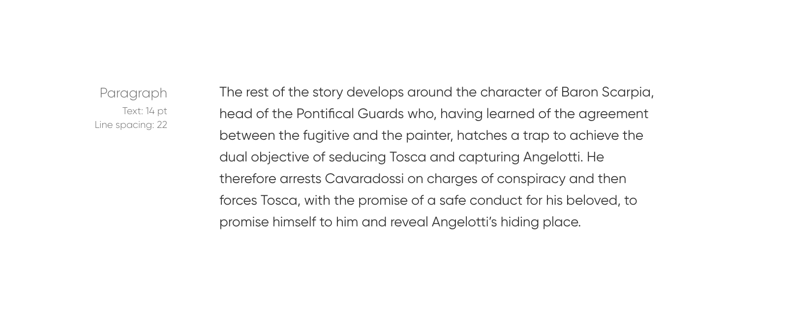
Spacing
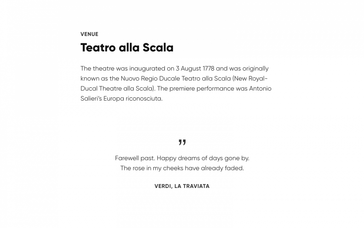
Line spacing is the vertical distance between lines of text. It makes the content easy to scan by eye and is important especially in large portions of text such as articles, blog posts or any longer paragraphs. Poor line spacing makes it difficult to read. A good practice is to make the line spacing about 150% the size of text height.
When you are combining different levels of text content i.e. overlines, headlines, body copy and call to action it’s also advisable to maintain a whitespace between these to make it more elegant and easy to read as well.
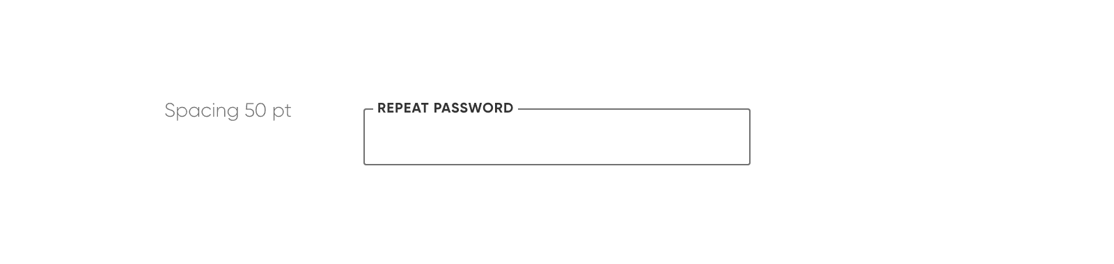
Letter spacing is of course the horizontal distance between single letters. Usually you won’t be changing letter spacing much but I find it very neat to make the spacing looser when it comes to smaller uppercase labels (in input fields for instance), about 50 pt should do the trick.
Colour
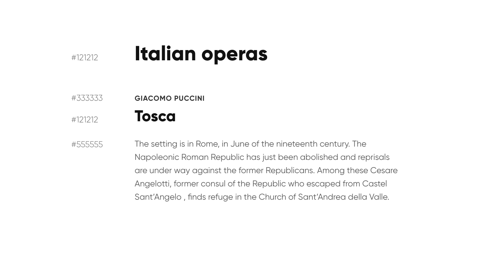
The last of principles of typography that I want to mention is colour. While it’s desirable to make the text black on white in most UI cases the first doesn’t necessarily has to be 100% black. Good contrast is key but too much of it can cause eye strain. Good practice is to make the copy slightly lighter than the header. I personally like to start with #121212 for headers and anything that has to stand out and #333333 or #555555 for body copy. Additional information like articles author or date created can sometimes be even lighter i.e. #AAAAAA.
Conclusion: Why typography is matter?
As you can see, there are a few key aspects to consider when working with text. I hope you will find the above useful when working on your new user interface project. Principles of typography are of great importance to the project you are working on. It is not only about aesthetic values, but also (and perhaps above all) about the legibility of the text. It affects the reception of your work and interest in it, do not disregard the above advice and you will gain a lot.
At Giraffe Studio, we create all projects with great care and commitment. We are a company that cares not only about creating a good, useful product, but also about aesthetic appearance (we always take care of principles of typography), because only such a combination will attract attention and gain interest. Our team consists of people with experience, passion and commitment who take care of even the smallest detail of the projects they work on. You can always rely on us and entrust us with tasks, because we never fail.
Our portfolio includes a lot of projects that we can boast of.
It is worth paying special attention to Let’s Fly. It is an application that helps travelers find the most convenient flight to their destination. It refreshes itself twice a day and sends notifications about changing ticket prices, so the traveler is up-to-date without having to check carrier websites several times a day. The application is easy to use and very readable, making it attractive to many users who like intuitive solutions. We have managed to create a beautiful, simple and really functional product that will make life easier for many traveling enthusiasts.
Another noteworthy product is the Timter. It is an application that responds to the needs of entrepreneurs and business owners. Timter is a very useful tool that allows you to fully control your business, minimize costs and optimize working time. The app was created with artisans in mind to help them manage their work. It is an extremely necessary and comprehensive product enabling the creation of orders, stock management and invoicing. Timter was created by professionals who wanted to improve the work of small businesses. We prepared a product that, in a simple, legible and transparent way, will help you optimize and improve the work of thousands of people.
If you want to create your own product, with all the principles of typography, you have a great idea that you will like and it will be useful, contact us in any way that is most convenient for you. You can write a mauk, call or fill out the form on the website. We are a team of professionals who will create a product for you that meets your high requirements. We will certainly not let you down and we will be happy to help. We are waiting for you.


